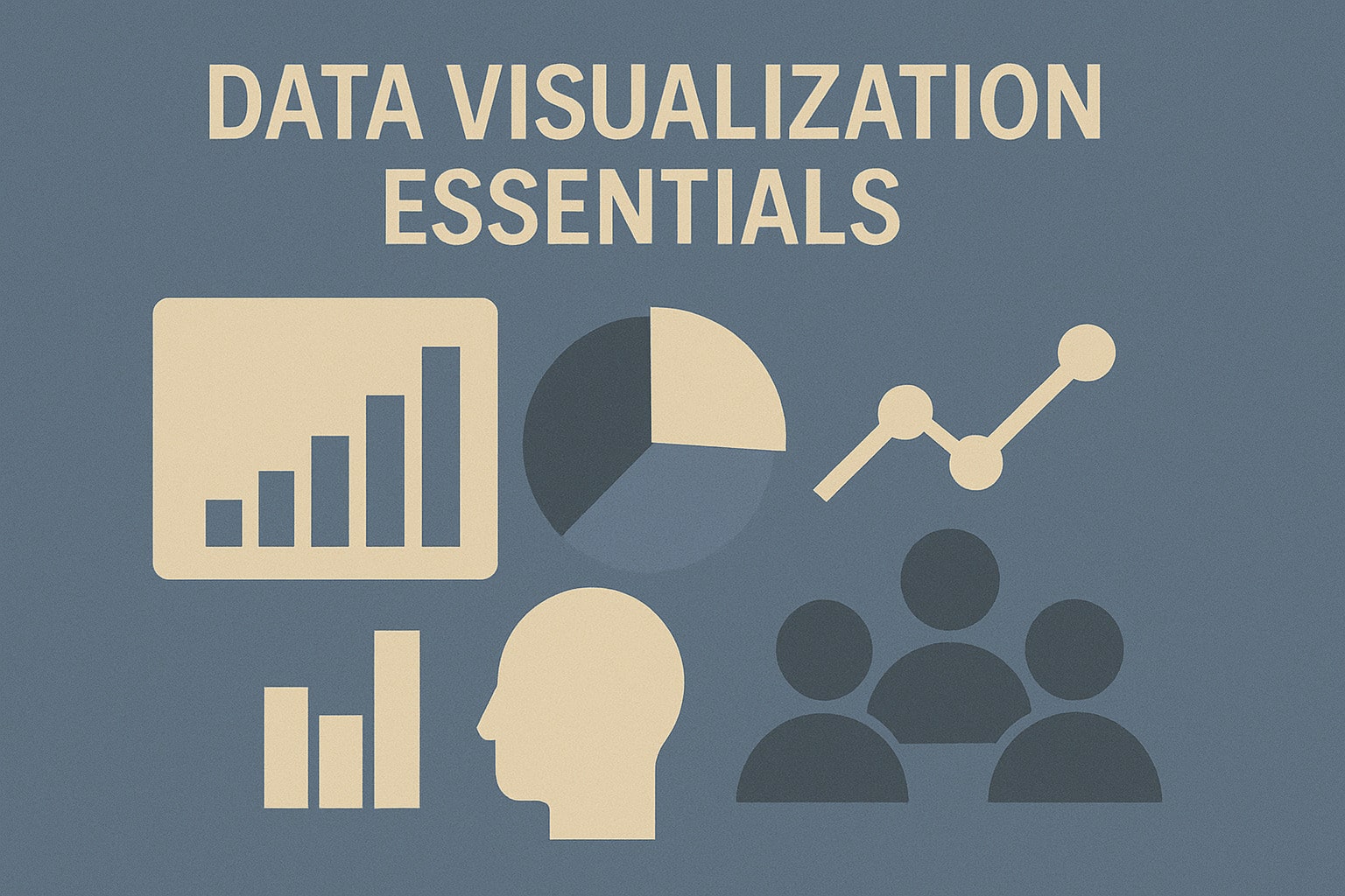
Best Practices for Effective Data Visualization
- admin
- July 24, 2025
- Data Visualization
- 0 Comments
In the age of data-driven decision-making, effective data visualization is crucial. Not only does it help in conveying complex information succinctly, but it also aids in uncovering insights that might be missed in raw data. Here are some best practices to create clear, engaging, and insightful visualizations:
- Know Your Audience
Before diving into the design, understand who will be viewing your visualization. Tailor the complexity and type of visualization to their level of expertise and interests. A business executive might prefer high-level summaries, while a data analyst may require detailed charts and tables. - Choose the Right Type of Visualization
Different data stories call for different visualization types. Use bar charts for comparisons, line charts for trends over time, pie charts for parts of a whole, and scatter plots for relationships between variables. Avoid using complex visualizations for simple data points. - Keep It Simple
Simplicity is key in data visualization. Avoid clutter by focusing on the essential elements of your story. Remove unnecessary gridlines, backgrounds, and data labels. Aim for a clean and uncluttered look that enhances readability. - Use Colors Wisely
Color can be a powerful tool to highlight key data points and draw attention. However, misuse can lead to confusion. Use a consistent color scheme, and ensure there is enough contrast between different elements. Be mindful of color blindness and choose palettes that are accessible to everyone. - Focus on Clarity
Ensure your visualization is easy to read and interpret. Use clear titles, labels, and legends. Avoid jargon and ensure that your audience can quickly grasp the message without needing additional explanations. - Highlight Key Insights
Draw attention to the most important data points or trends. Use annotations, callouts, or different colors to highlight these insights. This will guide your audience to the most critical parts of your visualization. - Maintain Consistency
Consistency in design helps in making visualizations more professional and easier to compare. Use the same fonts, colors, and chart types across different visualizations within the same report or presentation. - Leverage Interactivity
Interactive elements can make your visualizations more engaging. Allow users to hover over data points for more details, zoom into specific areas, or filter data dynamically. This can provide a more in-depth understanding and exploration of the data. - Provide Context
Always provide context for your data. Include relevant benchmarks, historical data, or industry standards to help your audience understand the significance of the data points. Context can turn an ordinary chart into a powerful narrative.
By following these best practices, you can transform your data into compelling visual stories that drive better understanding and informed decision-making. Happy visualizing!